SW&A, SALLY WILLIAMSON & ASSOCIATES
SW&A is a leading resource for improving the impact of spoken communications and has had a solid foothold in this space of over 20 years. Most recently Play had the opportunity to work side by side with SW&A in refreshing their look and brand communications. This involved a logo redesign, identity suite, marketing collateral and a refreshed website.
Brett Player says, "SW&A consults with the nation's largest brands, often training their top people. Hence, it is important for the SW&A brand to feel smart, approachable and forward thinking. I believe we hit the mark. Judge for yourself,"

Above you can see the new logo with dimensional signage as you enter into SW&A's new office space. The logo is meant to feel solid as the letters work in unison to reveal the amperstand in the negative space.

Above showcases the business card suite. We leveraged the SW&A color palette of red and black across all letterhead, envelopes, notecards, electronic templates and e-signatures. Additionally, Play created a Brand Style Guide to ensure brand consistency moving forward.

The SW&A responsive website is based in Wordpress and changes layout for optimal readability based on the user's screen size. We decided on a clean look, leveraging color, icons and photography throughout the site. Often there is the ability to contact SW&A about various services, programs and offerings. Additionally, users can register on the site through an e-commerce function, enrolling in Open Program classes. The site has a robust resource section, showcasing thought leadership and driving SEO.


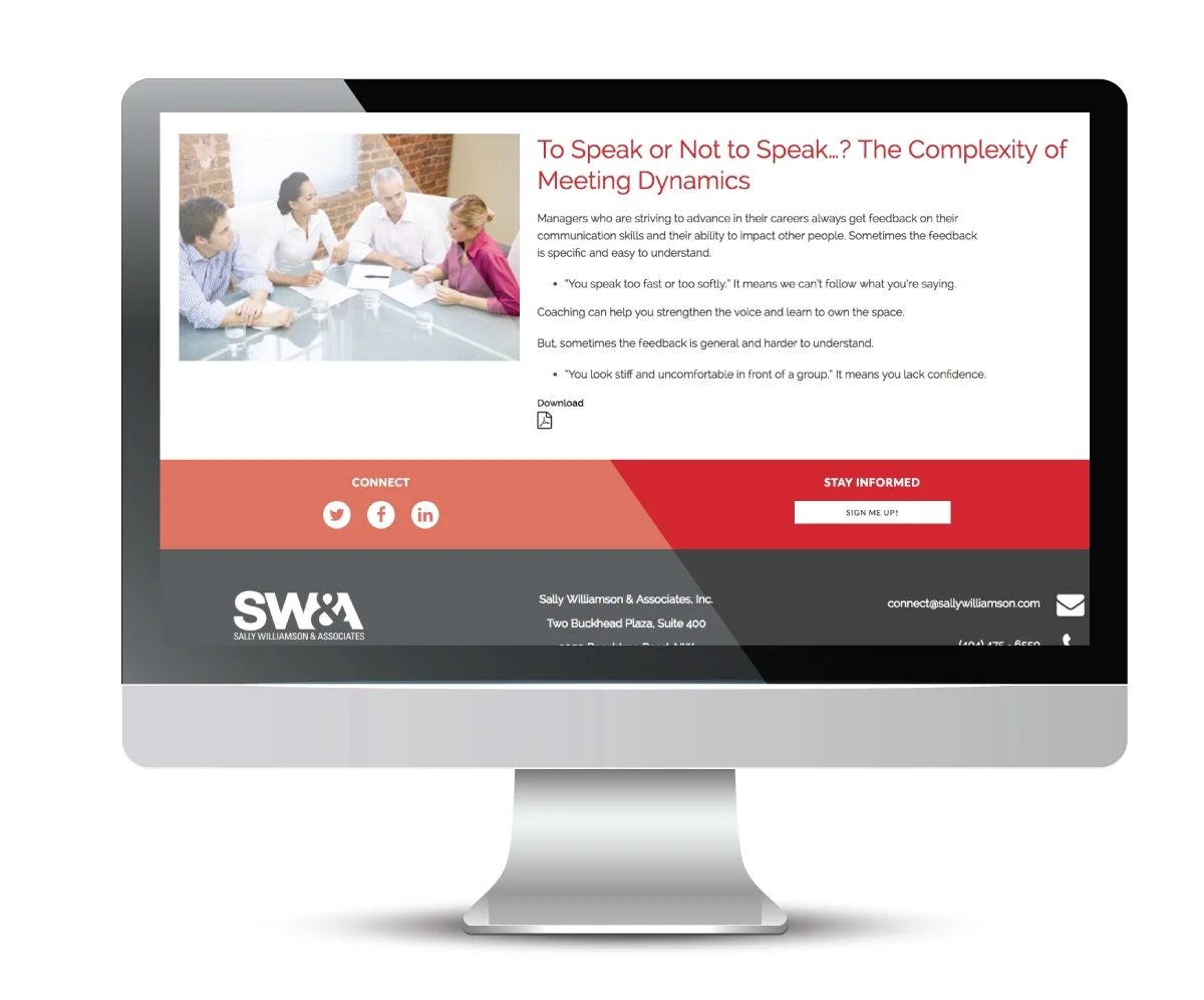
The above are examples of various pages within the site. The site is modeled to be informative and visually engaging. To visit the site in its entirety, click below.