DIGITAL
Play is extremely adept and experienced in digital design and marketing. Historically, our players have designed or built some of the most recognized and visited sites in the world, from Cadillac.com to ContinentalAirlines.com to MyCokeRewards.com.
Today, Play looks at each client as we focus on their set of circumstances and goals. We decide what type of technology fits best for their digital ecosystem looking into the future. With over 20 developers at the ready, Play feels comfortable across many platforms or functional requirements in creating websites or apps.
When creating sites, Play gets deep in defining the information architecture for optimal user experience for both consumer and internal client usage. We optimize the site for onsite and offsite search optimization to ensure the site is ready to leverage content to decrease price per click and attract organic traffic. Additionally, we ensure the site is set up for measuring site analytics and hosted for optimal speed and security.
Once the site is live, we work with our clients to market their brand through a mix of activities in a unified plan. This might include Adwords, display ads, video ads, geofencing, email marketing, push marketing through text, Google Business Profile management, customer reviews management, and more. Play does this through client preferred ecosystems like popmenu, Square and Zoho; or by utilizing a myriad of technology like Google, Groundtruth, Mailchimp, SEM Rush and many, many more.
In addition, Play manages client sites to ensure each site is working optimally month-to-month and is secure. We do this by hosting the site with a best-in-class service, and continue to update plugins on a monthly basis. Additionally, we audit the site ongoing for speed and security, recommending and installing plugins if needed. With content we will update the site via a client request or ensure the client can update the site themselves, if that is their requirement. We are always there to support and help with any client request or situation.
strategy, i.a. & design
mobile/website development
mobile app development
ADWORD & DISPLAY CAMPAIGN
Programmatic campaign
geo targeting campaign
PUSH & TEXT CAMPAIGN
GOOGLE BUSINESS PROFILE
REPUTATION MARKETING (REVIEWS)
e-mail design & marketing
DIGITAL MARKETING
Social and affiliate marketing
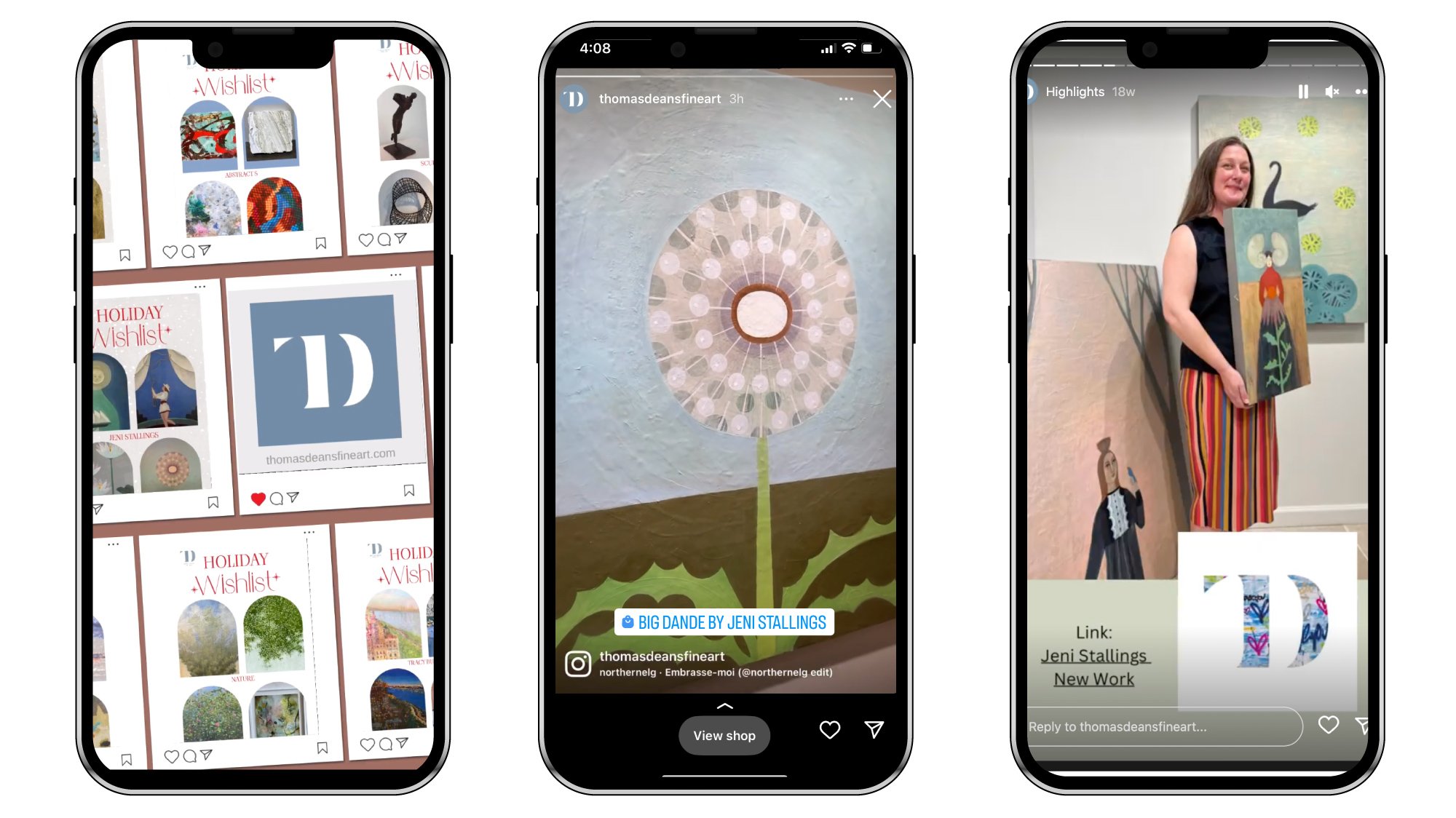
Some examples of mobile ads for Thomas Deans Fine Art, followed by site designed for The Imlay Foundation.