JBJ CONSTRUCTION
JBJ Construction approached PLAY for a brand refresh because the company had evolved since inception, and they wanted the brand to reflect this new construct. Also, the previous logo had some issues, the biggest being legibility. As most would see the logo on a work truck on job sites, simplifying the logo, making it memorable and easy to read from a distance was paramount.


Above you can see the logo in full name and in a reduced “lock-up” on either side of the business card. The symbol or mark is representative of a grid or building blocks, but also has the letters “J” and “B” in the negative space of the elements.


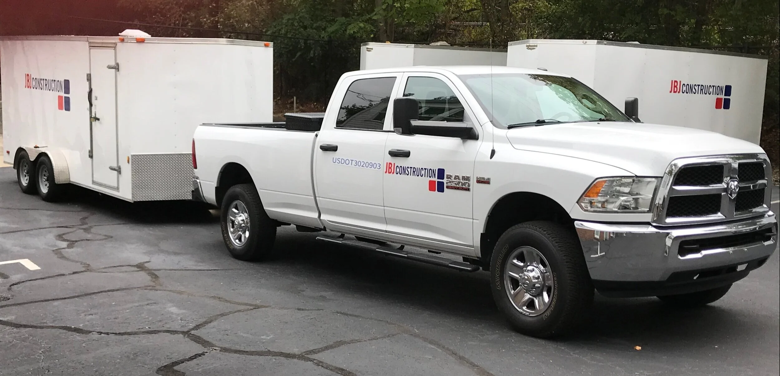
The rebrand included an entire Identity Suite, Brand Guidelines, Website Refresh, Building Signage, Apparel Design, and Vehicle Branding.